")
Good content is the basis of a good podcast. The visual aspect associated with podcasts cannot be completely ignored. Before the user even listens to your podcast, they see your cover art. This can play an essential role in creating the right first impression.
A well-designed podcast cover can not only interest your audience but also convey the essence of the podcast. It can also improve your visibility. Apple views artwork as a key consideration in selecting podcasts for New and Noteworthy. The essential part of creating a podcast is quality, unique content using a podcast hosting platform.
What is podcasting
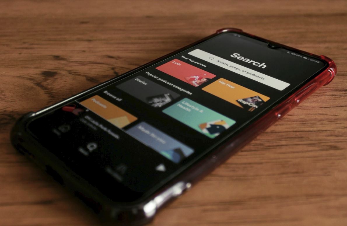
Podcasting is a type of news broadcast on the Internet. It’s like a radio; only you can choose programs by topic, download, listen to audio tracks at any time like on Youtube. You can listen to podcasts on SoundCloud and other apps for IOS and Android that are easy to find in the app stores.
The essential part of creating a podcast is quality, unique content. But do not forget that it is the fantastic cover of your show that creates the first impression and plays a significant role on the path to the project’s popularity.
Before diving headlong into future designs, there are a few things you should be aware of to get your cover art approved on Apple Podcasts. Let’s take a look at our meticulously compiled top of ten simple testaments that will surely help you create a quality cover.
The following tips will help you create a high-quality, compelling image the first time, so you don’t waste a lot of time redesigning your designs.
The image meets Apple Podcasts standards.
While Spotify, Google Podcasts, and other podcast services are still a great way to find new listeners, Apple Podcasts is the largest and most popular platform. Your podcast cover templates must meet the criteria and appear in the Apple directory listing.
The cover should be:
- minimum size 1400 x 1400 pixels and maximum size 3000 x 3000
- provided in RGB (and 72 dpi)
- saved in JPEG or PNG format with suitable extension (.jpg, .png)
- optimized for mobile devices (Apple recommends image compression )
Note: According to Forbes many podcast platforms are adjusting their formats to meet Apple Podcasts’ requirements, so if your image fits them, it is more likely to be accepted on other platforms as well.
Give voice to your podcast.
Podcasts are as different as the people who create them. Your unique cover design should convey the essence of the podcast. The main task here is to make the potential listener understand what this show is about at a glance.
Good to remember: Don’t use more than five words on your cover.
Choose fonts carefully
When adding text boxes to the cover, remove all visual noise. Using different fonts will only add to the confusion. We advise you to stick with the choice of one font, at least two. And, in the case of using two different fonts, use one of the serif family and the other sans-serif.
Avoid silly fonts
There is a myriad of supposedly “creative” typefaces that grab attention. These fonts are usually flashy, catchy, and incredibly blurry. Remember, font is another essential element of your brand that helps convey your message, so it must match the spirit of your show.
Good to remember: Permanently exclude papyrus, comic sans or other cool fonts that seem trendy at first glance. So far, no one has come up with a more readable and flexible font than Helvetica.
Avoid blurry pictures
Podcasts are overloaded with microphones and headsets, and the use of these images often ignores the podcast’s theme. Podcasts are the medium you use to broadcast your ideas: they are not the object of your show.


