
There can be a bit of a learning curve when it comes to interior decorating. Learning how to hang traditional wallpaper requires at least a little bit of study beforehand. Trying to wing it is a mistake that you may have to live with for a very long time.
However, there are some interior design instincts that are pretty reliable even if not backed up by study. Choosing to decorate in blue is a good example. With a multitude of shades ranging from the dark and powerful to the light and breezy, blue wallpaper can evoke almost any mood as a part of a wide range of design concepts.
Another quality that makes blue such a versatile color is that it goes well with just about any other shade you can imagine. Here are some colors and shades that work especially well as accents for blue walls.
1. Orange
There are many colors that you may feel complement blue by contrasting with it in a pretty way. According to color theory, however, orange is the only true complementary color for blue because they are opposite one another on the color wheel. Orange accents in a blue room is a dynamic combination that really makes it pop.
2. Green
Like blue, green is on the cooler side of the color spectrum. Combining blue with green doesn’t pop like blue and orange. Rather, it creates a soothing, restful atmosphere that might be appropriate for a bedroom or a den where occupants are intended to relax. Green and blue may be swirled together in soft, aquatic-looking wave shapes that evoke the ocean.
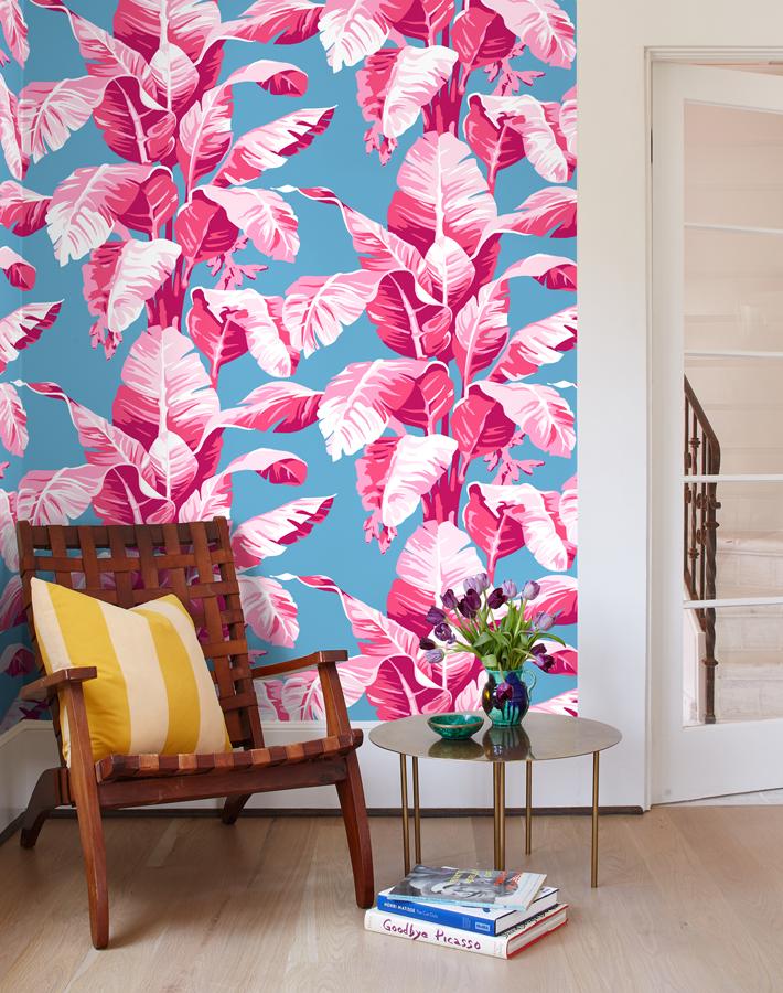
3. Pink
In children’s clothing, pink and blue are often completely separate to denote different genders. Such distinctions are totallly arbitrary and need not have any bearing on your interior design choices. Like orange, pink can complement blue by contrasting with it, but the contrast is much softer and subtler with pink than it is with orange.
4. White
A combination of pure white and dark blue gives a room a cool, clean look. Therefore it is very appropriate for a bathroom or a kitchen. It is reminiscent of antique porcelain, which also gives it a touch of elegance. You may be able to enhance this impression by using marble or another type of stone that closely resembles it.
5. Warm Neutrals
A warm neutral, such as beige or sand, doesn’t give quite the same pristine look as pure white when combined with blue but still complements it in an attractive way. Blue on off-white gives the impression of porcelain that has developed a patina, giving it more of a vintage look.
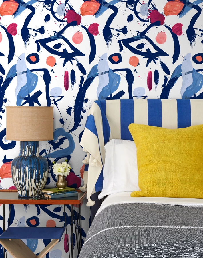
6. Purple
Purple represents the best of both worlds in that it is a cooler color but has red as a component. The many different shades of purple can lean toward either warm or cool. As a result, it can either enrich or complement blue. Many experts recommend combining jewel tones of purple and blue for a deeper, more sophisticated look.
Shopping for wallpaper online is easy and convenient, but color is only one aspect you have to consider. Other important considerations include its texture and pattern.


